Arc hooks another $30M in investment as EV interest spills over into electric boats
December 10, 2021
Tesla is deploying Starlink satellite internet dishes at Superchargers
December 10, 2021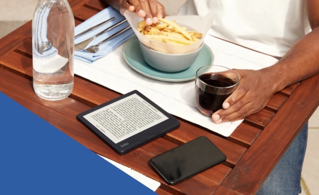
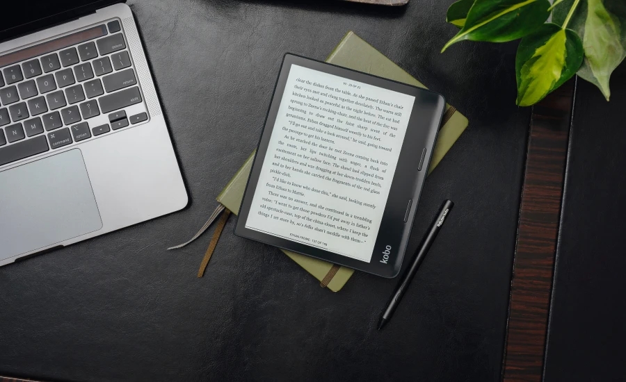
The latest pair of e-readers from Kobo provide a modest but noticeable upgrade to the display, stylus support and Bluetooth for listening to audiobooks but take a step down in build quality from the admirable Forma. But the new capabilities may be worth the upgrade, and the Libra 2 especially makes for an attractive little package.
The devices are successors to the Forma and Libra H2O, the forma of which (forgive me) has been my daily driver since I cracked the screen of my beloved Boox Poke 3. The main differences between the two new readers is size; most of the other features are the same. At $260 and $180 the Sage and Libra 2 aren’t cheap, though I think at least the latter is worth considering if you use an e-reader regularly and like audiobooks and Pocket.
The most visible new feature is the screen, which is the latest Carta 1200 E Ink display. Both readers have 300 ppi, which is more than enough to make the text look sharp. Comparing the older Forma to the Sage (as they have very similar builds) I was surprised to find that the new screen really does make a difference; the contrast is noticeably improved and the Forma’s letters seemed slightly grey next to the much darker Sage’s. Both look excellent, to be clear, but the new screen is an improvement.
Operation is much the same as previous devices, though the upgraded internals mean these are a bit quicker to wake, navigate and reorientate when you flip them. Once in a book, page turns took about the same amount of time as older devices, which is to say nearly no time at all even when skipping a few at a time. But when loading a whole new part of the book I found the old Forma is actually faster. All of this to say it’s fine but don’t expect iPad-like fluidity out of these or any e-reader.
Image Credits: Kobo
The audiobooks are a new thing for Kobo and the new devices have Bluetooth connections to make it possible — no speakers. Syncing a pair was as easy as it is on any other device, and from there I listened to a bit of one of the included books from Kobo’s store (you can’t load your own, for now) and it was pretty much as expected. You can speed up and slow down playback, skip forward and backward, and it keeps your place if you disconnect or shut it down. Audio quality was fine, apart from the usual small glitches that happen with accelerated playback.
Using a stylus on a device this size has never seemed practical to me, but I can certainly see it might be useful for an editor or something who likes to mark up their books. I found on the Elipsa that the functionality is … well, functional. Nothing fancy, just a few ways to directly mark up your books and documents. A symbol or notation-based way to add notes you can reference later (like Sony’s stars) would be nice, but they’re just getting started. At any rate the stylus works just fine, but since there’s no place to put it you’ll probably lose it in short order.
Image Credits: Kobo
Both devices have gotten thicker than their predecessors, presumably to accommodate the new hardware and stylus detection layer. It’s not an improvement, in my opinion, and the devices feel cheaper than the Forma and to a lesser extent the Libra H20. The body feels more like molded plastic than something sculpted, partly because they did away with all the decisive angles and wedges that made the Forma such an interesting shape. The new readers are also heavier than the old ones, which weren’t among the lightest to begin with.
Kobo has never been good at buttons, and these are no exception. The page turn buttons, especially on the Sage, are soft and indecisive and its recessed power button, while an improvement over the Forma’s awful side one, is still not great. The smaller Libra 2 fares better, with clickier but not too clicky buttons.
Image Credits: Kobo
I’m not a fan of the changes, as you can tell, but it’s not like it ruins the whole thing. But I hope that Kobo reclaims a bit of that premium feel in its next generation, because this has definitely been a step back.
Image Credits: Devin Coldewey / TechCrunch
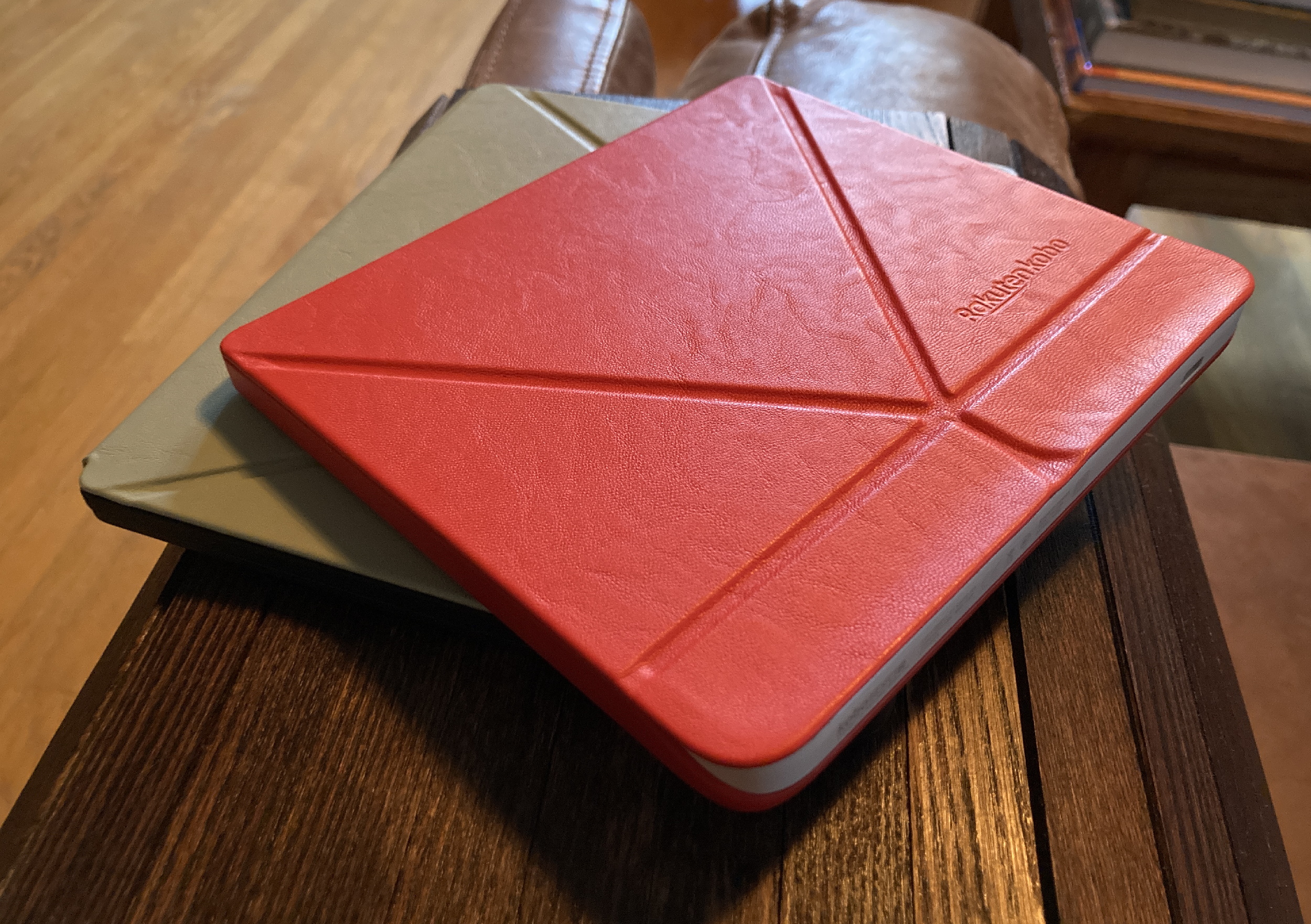
The recommended accessory for both devices is a $40 SleepCover or PowerCover. These leather-esque (not sure if real or fake, but it feels nice) folio covers attach securely and, like others on the market, wake your reader or put it to sleep when you open or close them respectively. These new ones add an origami-like fold system that lets them stand up at an angle.
I prefer my e-readers naked, so I wasn’t expecting to like these — and on the larger Sage, I didn’t. Already rather large, the Sage with the case becomes even larger, the folding bit seemed too loose and it covered up the power button. Even though it’s kind of superfluous, this bothered me. Yet without it the Sage seemed a bit fragile and lackluster.
On the smaller Libra 2, though, I loved the cover. It turned the somewhat plasticky device into a much more premium-feeling one, and the red color is actually quite attractive (plus the power button is accessible). Not only that but the fold-out piece is great for both setting it down and holding it — giving a bit more shape to it, like folding back the first half of a paperback. The recessed screen (I prefer a flush one) is protected from grime as well. While I still prefer the Boox’s ultra-compact, ultra-smooth design, the Libra 2 quickly ascended to second place for times when I’m not so worried about the space it takes up.
There are “PowerCovers” for more money, but if your device already lasts weeks, I don’t see the utility in adding more weight and bulk just so you can last a couple more weeks.
My final recommendation here is to skip the Sage and the PowerCovers — if you want big, go big and get an Elipsa or reMarkable. If you want Kobo and you want audiobooks, grab the Libra 2 and a SleepCover — you’ll love it. If you don’t need audiobooks, you can still grab a Forma. All the devices and accessories are available now.
Kobo Elipsa review: A sized-up e-reading companion with clever note taking


