Tesla is selling a microphone for in-car karaoke, but only in China
January 30, 2022
Tesla recalls Full Self Driving feature that lets cars roll through stop signs
February 1, 2022
Today’s cars are dumb where they should be smart, and smart where they should be dumb. Enough already. Make a car that’s pretty much all dumb and watch it sell — because what automakers are giving people is so bad, they’ll pay more to have less of it.
Cars now are like budget smartphones with wheels: loaded with bloatware, unintuitive and slow to operate. Carmakers have always struggled with user interfaces, but until recently the biggest problem we had was “too many knobs.” How I long for those days!
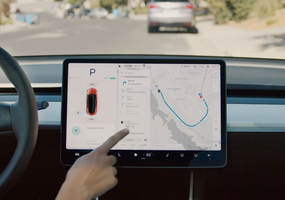
The proliferation of touchscreens and LCDs has made every car feel like a karaoke booth. Animations show reclaimed energy from braking, the speedometer changes color as you approach the limit, the fan speed and direction is under three menus. And besides being non-functional, these interfaces are even ugly! The type, the layouts, and animations scream “designed by committee and approved by someone who doesn’t have to use it.”
Not to mention the privacy and security concerns. I was dubious the first time I saw a GPS in a car, my mom’s old RX300, about 20 years ago. “Yeah… that’s how they get you,” I thought. And now, Teslas with missed payments drive themselves to be impounded. Welcome to the future — your car is a narc now!
The final indignity is that these features are being sold as upscale, not downmarket, options. Screens are so cheap that you can buy a few million and use them everywhere, for everything, and tell buyers “enjoy the next generation of mobility!” But in reality it’s a cost-saving measure that cuts down on part numbers and lets your dashboard team kick the can down the road as often as they want. You know this for sure because high-end models are going back to knobs and dials for that “premium feel.”
So here’s what I would like: a dumb car. This is what I think that looks like.
First of all: no screens whatsoever. This is for a couple reasons, both practical and aesthetic.
Practically speaking, nearly all of what these screens do is already performed by smartphones. There’s no need for a deeply outdated, laggy, manufacturer-branded Spotify or Apple Music app, your phone does it perfectly already. Navigation, similarly, is handled perfectly by the phone. Both of these, I need hardly add, already work fine with voice commands, too.
Not having GPS or data (or hidden microphones or cameras) also makes your vehicle feel more private, obviously. Sure, they can still get your phone, but at least they’ll need to put a GPS package on your undercarriage like the old days if they want to track your movements beyond that.
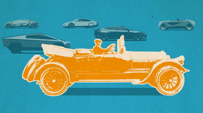
Image Credits: Bryce Durbin / TechCrunch
For media, an aux input does it all. Doubles as a charging cable, and you could easily swap it out for different and new devices. Include a bit of smart cable routing and your phone can conveniently be mounted in a number of places around the cockpit — not that you should be looking at it or touching it (use your words). If you want Bluetooth, I’ve got a dongle for you. The only thing the car should have is a volume dial, maybe a three-button basic playback control cluster on the wheel.
As for the climate controls on those big center LCDs, a couple knobs will do it. No one really believes these “zone” things work, right? No car is big enough to have zones in it. A blue-to-red dial, blower select, and A/C and recirculate toggles get it done just fine.
In the instrument cluster, we can have ordinary needle gauges. Speed, fuel, oil, temperature, and the usual idiot lights: check engine, low tire pressure, etc.
Aesthetically, the digital versions of these have always bothered me. Drivers are meant to be focused on the road, but these clusters often have distracting, bright information that’s constantly changing. The difference between 69 and 70 on a gauge is an eighth of an inch, just like the difference between 67 and 68, and 68 and 69. That continuous, predictable variation is intuitive and precise enough for pretty much any driving purpose. On a digital display the numbers are blinky and big, constantly drawing your eye as they dip from 71 to 69, numbers that look completely different and you can’t really check out of the corner of your eye.
Losing the media and navigation means we can do without a lot of the computation capability that goes into a modern car, but we don’t want to go without it entirely. There are safety features introduced in the last few years that ought to be included on every new car, smart or dumb. Traction control, blind spot and lane exit warnings, and even automatic emergency braking require a certain amount of CPU power and they should get it, because they save lives. Backup cameras are one thing people may not want to go without — but you’d be surprised how informative a basic proximity beeper is.
The engine itself is also far more computerized than in the old days. Unlike the computerization of the cabin, however, this has many positive effects, such as improved mileage, lower emissions, better reliability, and easier diagnosis for servicing. The exact level of electronics required for safe, responsive pedals and steering are probably a matter of some debate, but we can leave that to the experts.
I’m tempted to ask for manual window knobs and door locks, but that would put us over the line into affectation (if indeed we have not already left that line far behind). We’re not trying to recreate vintage cars but to make a modern one stripped of superfluous technology. Power seat adjustment, though, that’s a luxury even today. Use the lever.
Note that nothing I’ve proposed is specific to gas-powered cars; electric vehicles are just as prone to these bad decisions as the rest. This isn’t about nostalgia but rather abandoning a pernicious yet universally followed design philosophy. (…Okay, it is a little about nostalgia, but only a little.)
Of course what I’m describing, despite its seeming simplicity, probably amounts to something like a luxury vehicle, in that it’s not aiming at minimizing cost. Nearly every existing car line is designed with the “latest” tech in mind and to do away with that is a major departure from existing molds, assembly work, QA, and so on. Plus while I think the concept would attract many, it still wouldn’t outsell much. It’s a niche vehicle for sure, and the price would reflect that.
Still, all I want is a car that isn’t as overbearing as all the rest of the devices I already own, sending me notifications, dinging, reporting errors, asking permissions, needing updates — my god! Leaving aside the whole spurious “back in my day” argument, there simply isn’t much point to these features now, certainly not enough to justify their prominence or poor quality. Let’s see what it’s like to make a car that focuses on letting the driver drive, and accommodating rather than trying to replace the supercomputers we all carry around in our pockets.


