Everything Elon Musk and execs shared (and skipped) at Tesla Investor Day
March 9, 2023
Ring launches a higher-res, battery-powered doorbell
March 11, 2023
The reMarkable 2 is a great tablet for reading long documents on, annotating them, taking notes, sketching… but not for full-on writing. At least, it wasn’t until they put out this great keyboard folio that converts this tablet into a pretty compelling minimalist writing station — if you don’t mind a slightly premium price.
The new case is not unlike those available for the Surface, iPad, even other e-paper devices like the Boox Tab X. It has a leather or leather analogue exterior (comes in black or milk chocolate brown), then a sort of three-layer design where the cover goes on top, the tablet is in the middle and the keyboard hides below until summoned.
If you’re familiar with other keyboard folio-type cases, this one won’t be much of a surprise, but I’ll say it is very nicely done and well made. Wait, you say, you’re doing a whole review just of a cover? Well, it’s kind of unique and the reMarkable is a cool device and there isn’t a lot like it out there! I know I’m not the only one looking for something like this. They sold a million of these things, after all.
Anyway, the folio works as a regular cover if you just want to take notes or read in portrait orientation. But once you flip off the cover, you can lay it down and take hold of a couple tabs on either side and lift the screen free of the keys underneath. It folds up and snaps into place with a couple magnets and you’re good to start typing.
Here’s how the deployment process works:
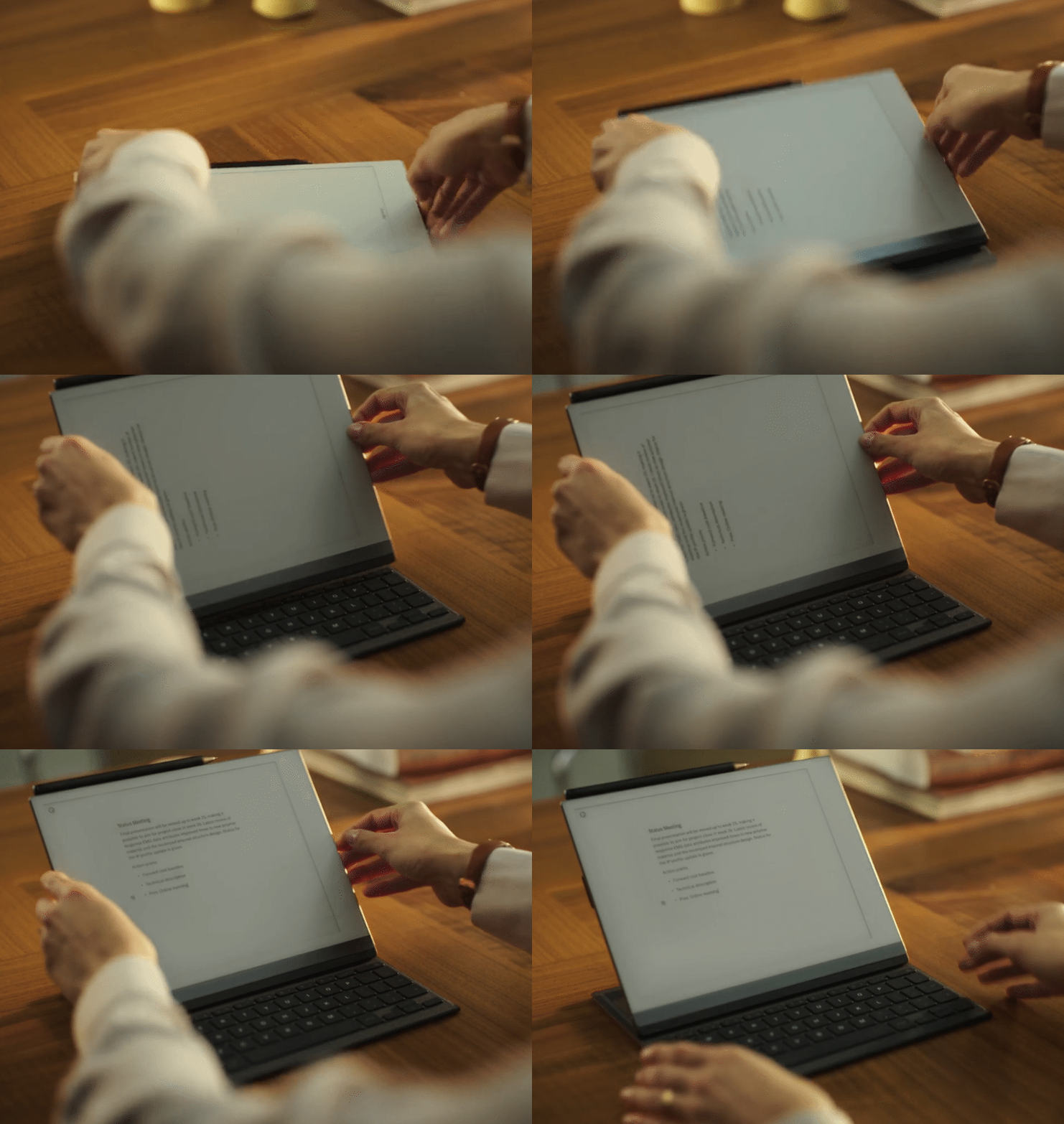
Image Credits: reMarkable
There’s no Wi-Fi or Bluetooth to connect or configure; the device and case features a little contact interface that activates the keyboard and powers it. Much simpler, but of course it means you can’t have the keyboard on your desk and the tablet propped up somewhere.
There is essentially zero lag between tapping a key and the letter appearing. It’s the best I’ve seen in a non-LCD device and I applaud reMarkable’s work here.
The keyboard is definitely of the compact variety you tend to find as companions for tablets; the letter keys have a full-size layout (equal size and spacing to a normal one) but space is saved by making the number keys squat and the modifier keys narrow.
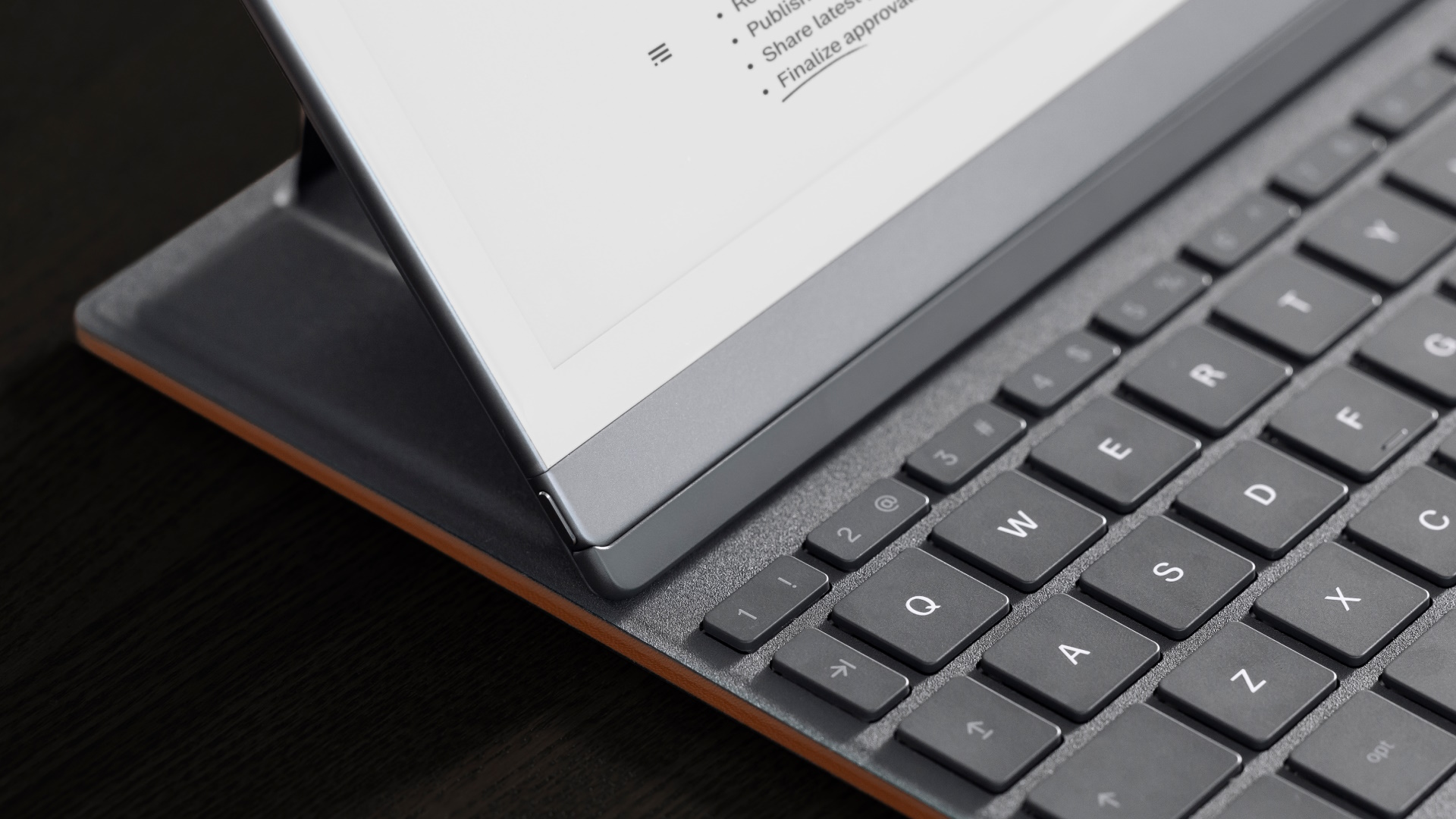
Image Credits: reMarkable
This is generally speaking fine, though I would prefer a slight modification that makes the long, weird backspace key larger and does without caps lock (who needs it?). There’s also no delete key, though shift-backspace does the same thing.
The chiclet keys don’t have a lot of travel or play but are comfortable enough; not as good as a laptop, but better than many keyboard cases I have used and certainly much better than any on-screen keyboard out there. (I haven’t tested a lot of these things, to be honest, because generally I don’t see the utility — personally I use tablets to consume, not create. I have a nice ergonomic mechanical keyboard for when I really need to write stuff.)
Minimal editing — perhaps too minimal
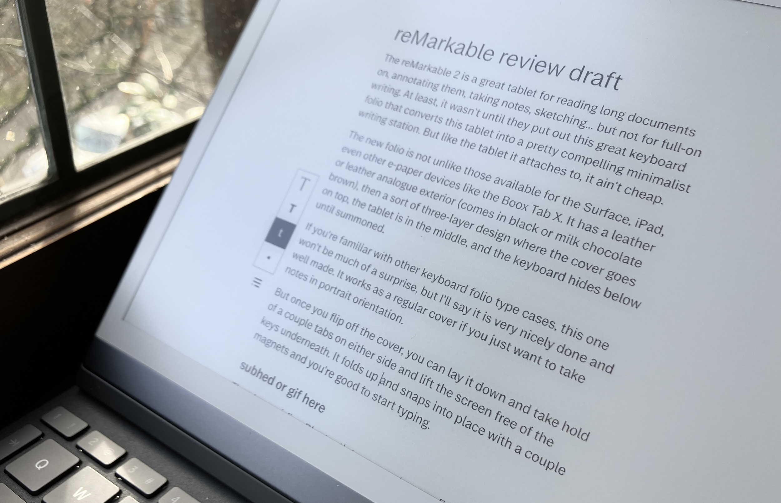
Normally that little menu isn’t even there, just the lines. Image Credits: Devin Coldewey / TechCrunch
An update with a new text-focused interface will ship with the keyboard, and while you can use it with the on-screen one (which is serviceable), the physical keyboard is obviously a much better option.
By hitting the text T in the left-hand drop-down menu, a column for text appears down the middle — or rather, doesn’t appear. It’s there, but has almost no markings to indicate it. In keeping with reMarkable’s minimal aesthetic, there is nothing but a little place marker indicating where your text will appear.
The idea is to let you focus on the text, providing a few simple formatting options. Slightly too few, in fact.
In principle the editor works, and I like that it’s very much like a typewriter filling a blank page, not a word processor. And the ability to grab your stylus and jot a note here or there — “more on this,” or just an arrow connecting two paragraphs — is excellent. Handwriting and sketches are attached to the text they were written next to, so you when you scroll up and down they go with it. On the other hand, you can’t create a text field next to existing drawings, as far as I could tell — it starts a new paragraph below.
But while the simplicity is admirable and I was able to draft out a post quite easily, I immediately wanted several things that weren’t available.
For one thing, the text is a bit too small and readability suffers, especially with the lack of a backlight. From two feet away, it looks a little lightweight, and indeed when you get close the rendering is speckled — a consequence of the fast refresh time.
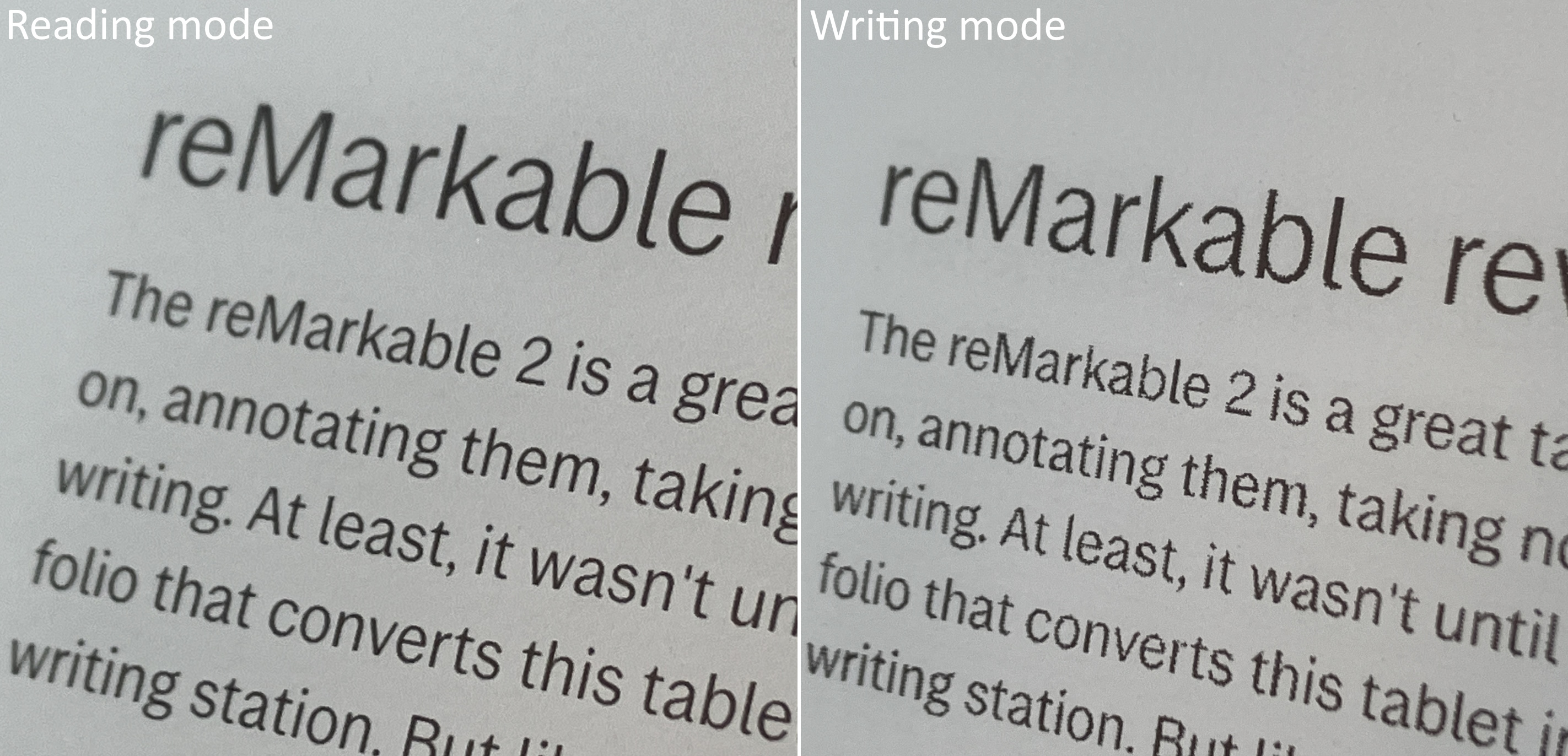
Image Credits: Devin Coldewey / TechCrunch
It didn’t bother me that much, but if there were a couple other sizes I would have bumped it up one just for added clarity. Bold and italic might be nice, though I can do without them in a pinch.
It would also have been good to be able to control the layout and formatting on a per-document level. The only option — and it is not a bad option — has the text in the middle two quarters of the screen, and sketch space on either side. Honestly these are fine, but I would have just liked a wider and narrower option, perhaps a justification and alignment setting, and the ability to put the text column somewhere else.
I’m aware that the point is minimalism, and here I am asking for all these settings. But it’s not like all this markup will be cluttering up your screen — it’s a set it and forget it thing since not everyone has the same preferences and needs. There are lots of templates and options for handwritten and sketched notebooks, and I’d like the same for text-based ones.
Editing via touchscreen is fine, but reMarkable should take some UI tips from others (or users) in this space. It was easy to select a word, but not a sentence. Tapping in the text area is responsive but in the sketch area does nothing (like go to the end of the nearest line). There are several such little missteps and missing pieces here that can and probably will be fixed in an upcoming software update.
I asked about some of these things and reMarkable said, “We have plans to add more features and to polish and improve on the experience over the coming months,” but didn’t share a roadmap. I trust them to do it right, but it’s barebones right now by design.
Integrated, kind of
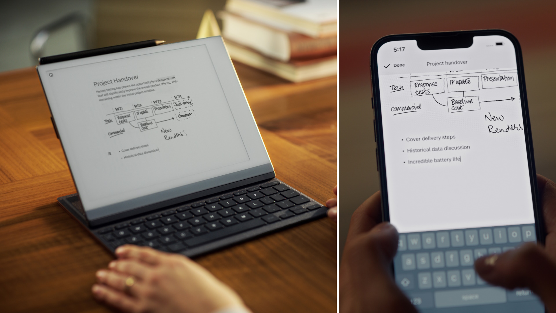
Image Credits: reMarkable
Another aspect of reMarkable’s insistence on a more or less contained and non-distracting environment is limited integrations. I suppose we should be thankful: at first there were none at all! But now you can sync files with Dropbox, Google Drive or OneDrive, though these are all secondary to its first-party Connect feature, which costs $3 per month (first year’s free, at least). This covers syncing of your docs between the desktop and mobile apps and the tablet itself — though you can only have one active tablet at a time, something I wish they would change.
Syncing works fine for the most part, occasionally a bit laggy (like any cloud service) when dealing with multiple documents but generally speaking you can count on it to have the latest version of something, with your additions and sketches all up to date.
It’s clear that reMarkable wants to keep you in their ecosystem, however, and there is no opportunity to sync with services like Simplenote, Evernote, Bear, things like that. I get that some of these can be catch-all platforms that don’t really mesh with the reMarkable mission, but honestly if I could put Simplenote on it I would use the reMarkable 10 times more.
As it is I can still find a place for it in my workflow, particularly in writing longer pieces that don’t fit well with my other writing platforms: a long story in progress, an ongoing outline for a book, that sort of thing.
At $200, the folio case is two-thirds the price of the $300 reMarkable (though the latter has really come down over the years). It’s certainly well made and the keyboard is nice — and it definitely multiplies the purposes of the device. And let’s face it: When it comes to writing on an e-paper device, our options are limited. This is a good one, even if it may be too minimal for some tastes and anyone doing long-form writing may opt for a “real” keyboard.
It’s getting close to my dream of a digital typewriter, and at $500 all in the price is high but not crazy, considering what a “good” laptop costs these days. If, like me, you need a context shift in order to truly focus on reading or writing, it may be $500 well spent.

